
A school logo must hold up when reduced to a favicon, embroidered on a polo shirt and printed in monochrome on a term report. Before considering colors or symbols, it is this requirement for durability across multiple formats that determines which design choices are viable. Too many schools start with a visual that looks appealing on screen, only to discover later that it becomes illegible at small sizes or in black and white.
Technical durability of a school logo: tests to run before approval
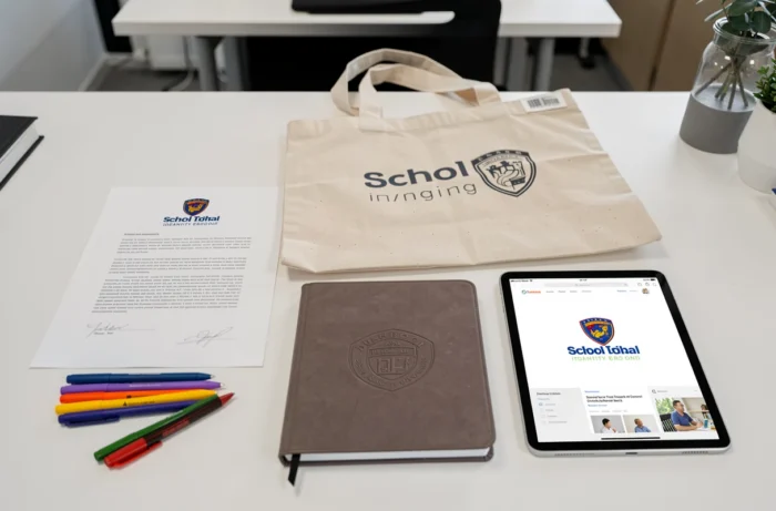
An educational logo that fails the small-format test is a failed logo. A school’s list of real-world applications is long: letterheads, lunch cards, outdoor signage, stamps, school portal app icons and embroidery on sportswear. Each application has its own resolution and rendering constraints.
The most revealing test is reducing the logo to favicon size (16 x 16 pixels). At this size, all text disappears, fine lines merge and gradients become solid blocks of color. A logo that remains legible as a favicon will work everywhere else.
We recommend systematically checking three versions before final approval:
- A monochrome version (black on white, white on black) to check that the shape alone conveys the identity, without relying on color.
- A version reduced to 20 mm wide, simulating printing on a badge or stamp, to identify details that disappear.
- A reversed version on a colored background, since the logo will probably appear on banners, school fair posters or photographic backgrounds.
If any of these versions fails, the design should be simplified before discussing the color palette.

Accessibility and color in a school logo
The W3C specifies that logos are exempt from the minimum contrast requirement that applies to ordinary text under the WCAG guidelines. This exemption is often misunderstood: it applies only to the logo itself, not to accompanying text elements (the school’s name, motto or grade level).
In practice, if the school’s name appears alongside the symbol, that text is still subject to standard contrast ratios. It is therefore best to plan from the outset for versions suited to light and dark backgrounds, rather than forcing a single placement that compromises legibility on some digital platforms.
Another technical point deserves attention: color should not be the sole means of conveying information. The W3C emphasizes this principle for interfaces, and it applies directly to schools that use color to distinguish grade levels or buildings. Consistently pairing each color with a shape, icon or word ensures that the information remains accessible to people with color blindness.
When it comes to creating a memorable educational logo, this dual reading of shape and color provides a technical foundation that many schools overlook in favor of visual impact alone.
Typography for an educational logo: legibility versus personality
Typography in a school logo must constantly balance two competing demands. On the one hand, legibility at a distance and at small sizes calls for open letterforms with generous counters. On the other, the school wants to express a personality that sets it apart from neighboring schools.
Fine serif fonts break down in embroidery and engraving. Very delicate serifs, which look appealing on a Retina display, lose their structure on fabric or an ink stamp. Conversely, an overly neutral sans serif (such as Helvetica) produces a generic logo that could belong to any school.
A practical compromise is often a semibold weight in a humanist typeface, whose slightly open terminals retain character without compromising the physical result. Custom lettering is another option, but its cost is only justified if the school has a full brand guidelines budget.
A common pitfall is using a free font that is widely available in online design tools. The school then ends up with a logo that is typographically identical to dozens of others created from the same template.
Symbols and icons: what the education sector overuses
The open book, quill, mortarboard and tree of knowledge saturate school imagery. They work as recognizable signals of the sector, but an overly generic symbol prevents the logo from being memorable.
A memorable logo is built around a distinctive element connected to the school’s history, location or specific educational project. An architectural detail from the building, a feature of local heritage or a reference to the school’s educational focus (bilingualism, science or the arts) creates a visual connection that an open book never could.
The most effective combination pairs a distinctive symbol with strong typography, without overcomplicating the design. More than three distinct graphic elements (symbol, name and motto) weaken the composition’s impact and adaptability at small sizes.
Logo variations and brand guidelines: ensuring a school logo lasts
A logo approved without brand guidelines is destined to be distorted. Administrative teams, parent associations and print suppliers will all use it, often without any graphic design expertise. A basic brand guidelines document defines clear space, exact colors and prohibited uses.
The file formats provided matter just as much as the design itself. At a minimum, a school needs a vector file (SVG or vector PDF) for printing and signage, and a transparent PNG for digital use. JPEG files on a white background, still too often provided as the only format, create background-removal problems every time the logo is used on a new medium.
A school logo’s lifespan is measured in decades. Design trends come and go, but a well-constructed logo, tested against real-world use cases and documented in accessible brand guidelines, will outlast changes in leadership without requiring a premature redesign.